Planning Japan in 3D
I built this for my girlfriend and me to plan and get around Japan on our recent 13-day trip. When we started planning, we both found it overwhelming to keep track of every city, activity and train. I wanted a fun way to organise it all in one place, where we could both edit the plan and see changes live.
What it does
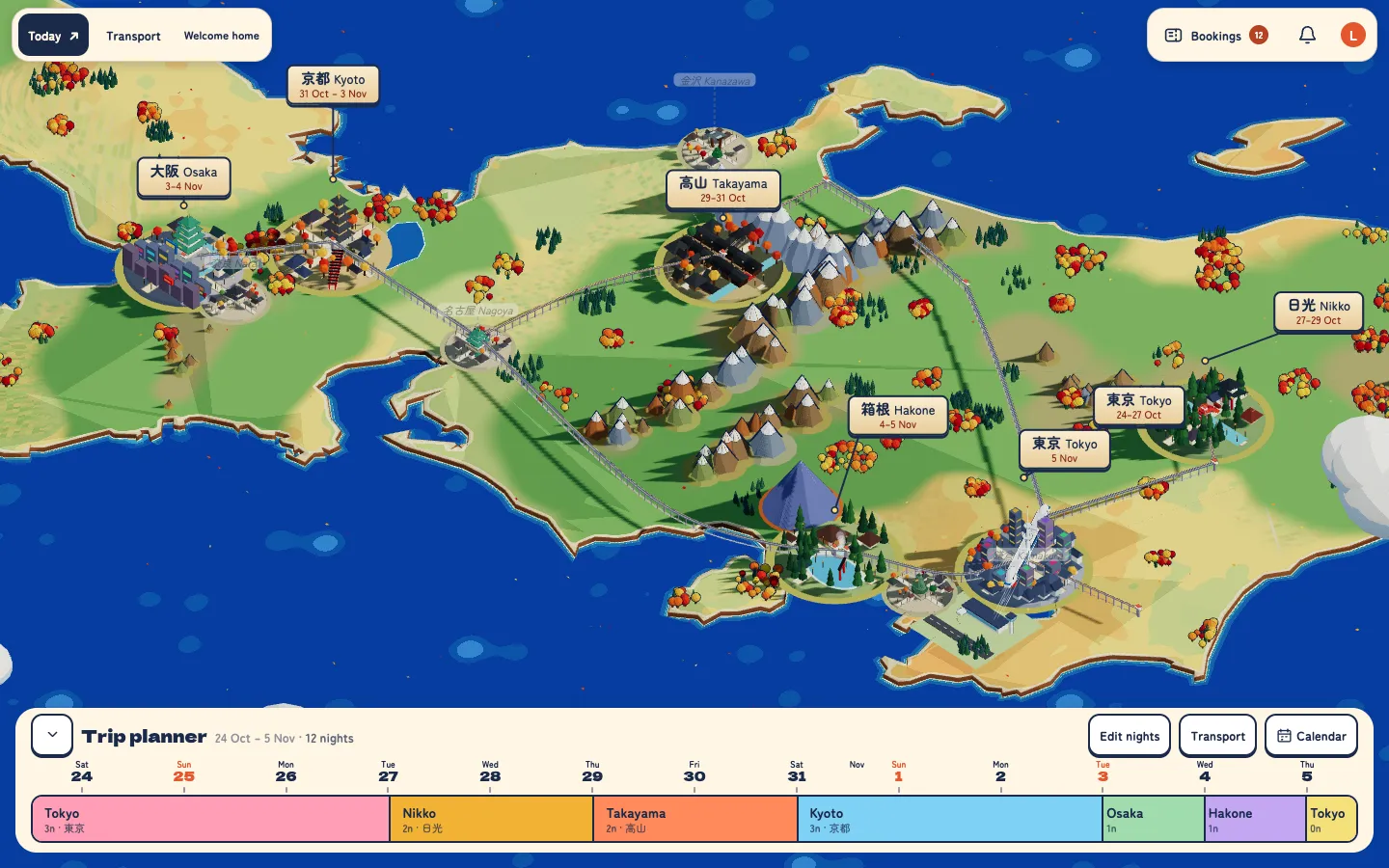
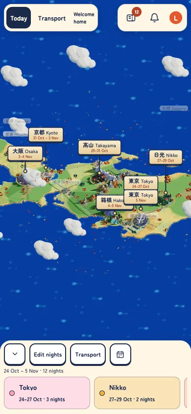
Map and trip planner bar. A top down 3D view of Japan with all your stops on the route. The bar at the bottom gives you the whole trip in one go and you can drag between two cities to change the dates.
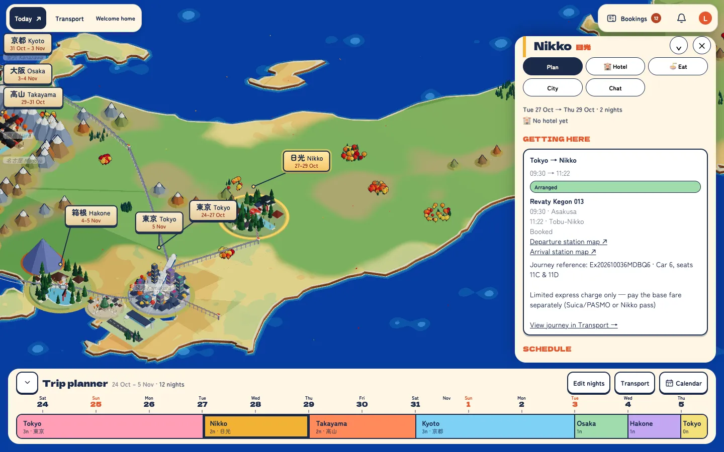
City panels. For each city: what we’re doing, where we’re based and how we get there.
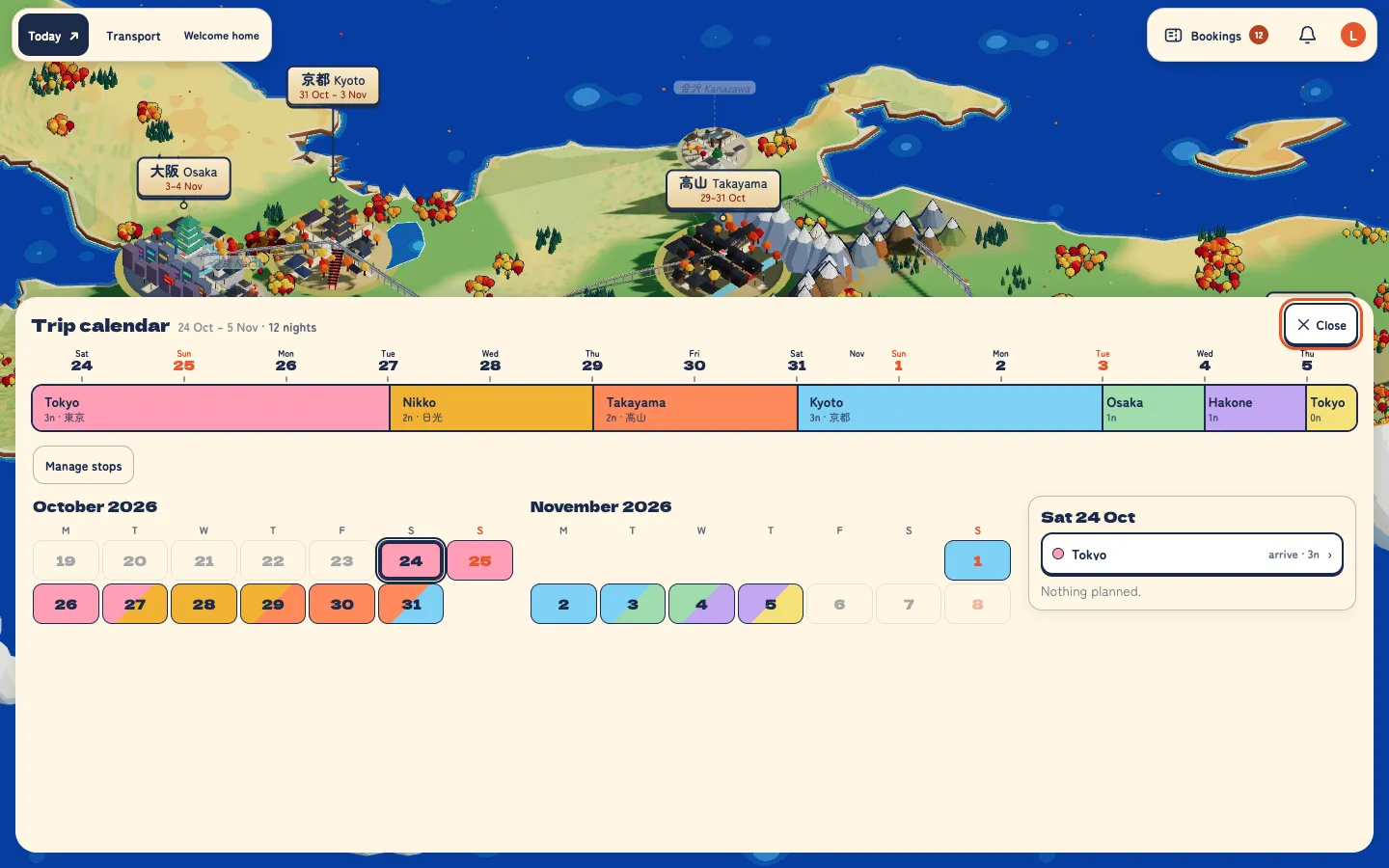
Calendar. What’s happening and when, plus an editor to add, reorder and remove stops.
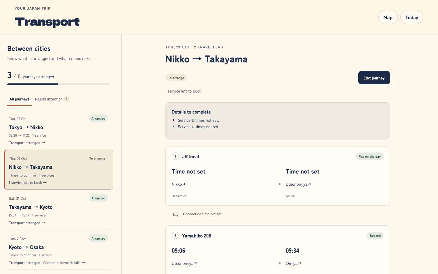
Transport workspace. All the trains between the cities with times, booking details and links to the tickets. That was by far our most used feature. Getting around Japan by train is confusing and one morning in Osaka we had to catch an early Shinkansen to Tokyo and were very much worried about getting the times wrong. Having the departure times and the ticket links all in one place meant we could double check everything as we were travelling and we got to the platform with plenty of time to spare.
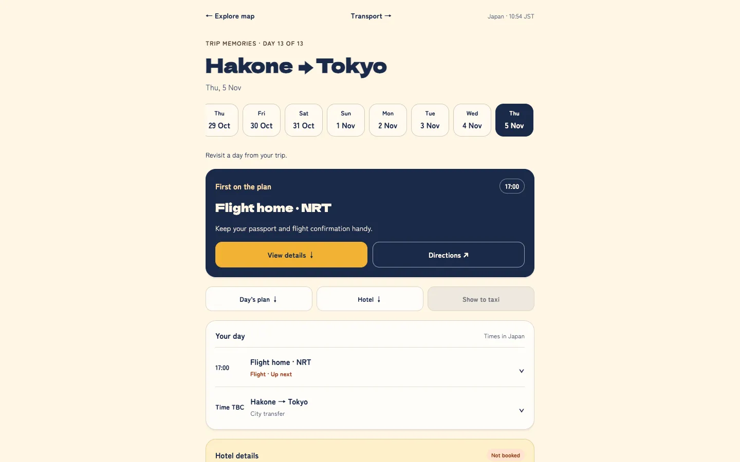
There’s also a Today view for the current day’s plan (that’s what we’d open up first each morning).
Design
I absolutely loved the style of Token Town and that was the genesis of it. I really liked the idea of a top down view of Japan so you could see where in the country you were heading next.
Under the hood
- Client: React Three Fiber to render the 3D diorama, zustand for state.
- Server: Fastify and SQLite, with WebSockets pushing every change to both of us live.
- Shared types: one TypeScript contract between client and server.
- Mock API: the UI could be developed with a backend completely offline.
What went wrong
The 3D design caused most of the bugs. The one that stands out: the map would randomly disappear when you zoomed in on cities. Certain models combined with a specific camera angle triggered a rendering glitch that made the whole scene vanish.
It was fun, but not practical. Performance was a constant fight, with slow rendering or the app freezing on mobile. Changing the plan was also harder than it should have been: adding a city to the trip plan meant creating a new city model and updating the code, and removing a city meant doing the reverse. So the novelty wore off quickly once I was fixing issues instead of using the app.
I designed for the wrong device. We designed for desktop first and then ported to mobile. About 90% of our usage was on mobile and mobile is precisely the platform where a heavy 3D scene is going to be a nightmare.
What I’d do differently
- Mobile first. Design for the phone, then scale up to desktop.
- A real map instead of 3D. Something like OpenStreetMap with custom styling, which would give us:
- Pins for hotels, activities, and stations so we can navigate inside the app.
- Notes on each pin, such as a hotel booking reference or a link to a train ticket.
- Better performance, with no 3D scene to render.
- Flexibility: changing where we go would be a data edit, not a code change.
- An AI assistant. We often ask ChatGPT for coffee shop and restaurant recommendations. Built-in, it could pin any suggestion straight onto the map.
Where it ends up
So we did use the app a fair bit on the trip, but we mainly used the transport features because we found that bit required the most planning and organising. Maybe if I made the improvement mentioned above, we might have used all of the app’s features, but who knows, maybe on our next trip.
I haven’t researched this properly on other apps, but I suspect there’s room for a small, playful travel planner that works for any destination. For now, this stays a fun toy project that helped two of us get around Japan.